cat
Illustree for CAT3 min read Bringing the City Airport Train to its customers
Service design for
Branding, information, and sales all in one: Even a basic website can cover the entire customer journey. Especially if it works like an app.
The Objective
It has to be simple.
Because flying is already complicated enough.
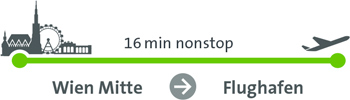
The City Airport Train: from Vienna Airport to the city center in 16 minutes. Cheaper and faster than any taxi. With all the amenities of business class. Nothing else compares.
All passengers must be able to sense this unique quality on their phones. That’s how fast and convenient the solution needed to be.
The approach
Conceived as an app.
Deployed as a website.
What CAT passengers need is a ticket. But would they download yet another app just to do that?
Instead, we designed a lean, clean website that runs perfectly on smartphone browsers. It has the look and feel of an app, but it’s easier for the passenger to use and costs our customer, CAT, much less.
The result
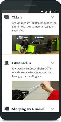
Information and tickets.
All on a single screen.
1. The USP becomes clear: “This is premium!”
CAT extends business class beyond the airplane. The page makes the upscale offering immediately tangible: more comfortable travel, clear information, a fair price. All on a single page.
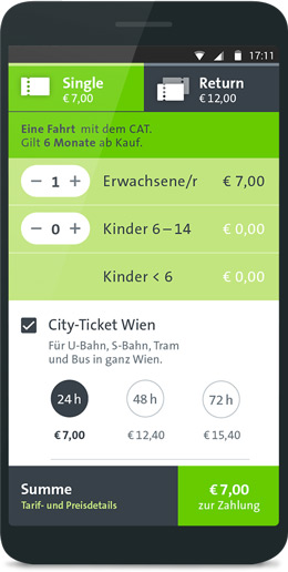
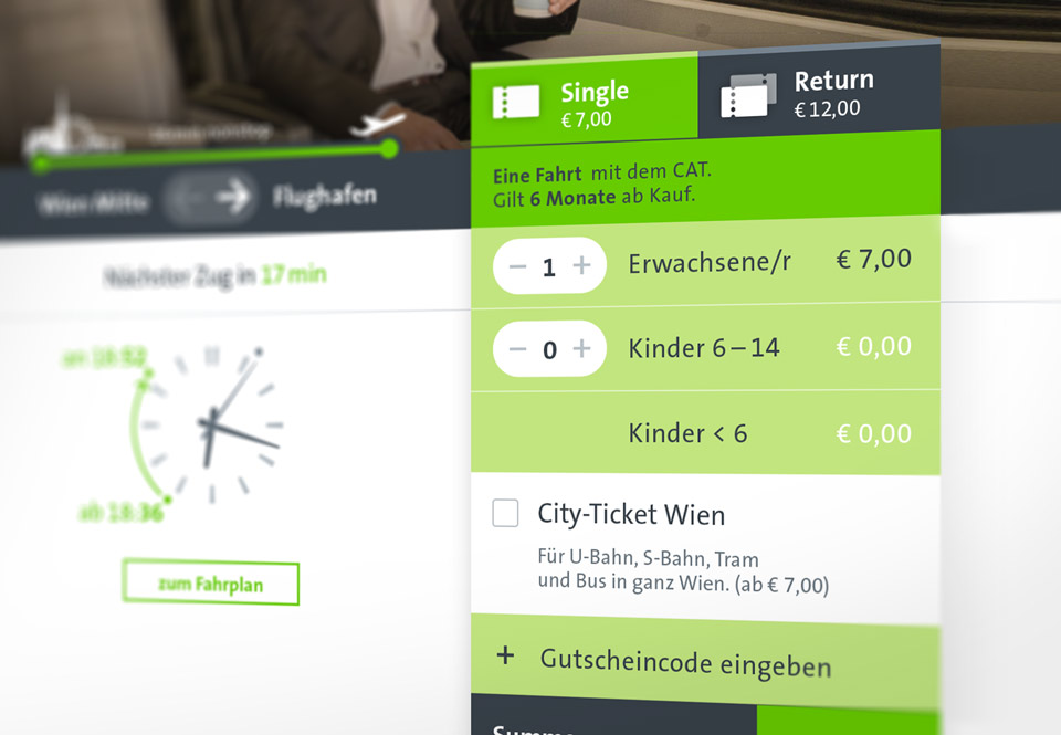
2. Quick ticket purchase
Book directly on the website. The ticket displays immediately. Or reaches the traveler’s phone via text message. It doesn’t get any simpler than that.
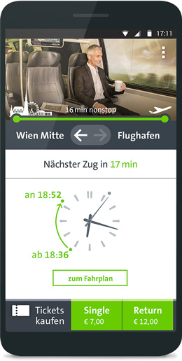
3. Real-time assistance.
When is the next train? When will I arrive? My ticket is just a click away. That’s clear, sensible service design.
An app or not an app,
that was the question.
Useful instead of “heavy use”. Most people use no more than five apps heavily on their smartphones (according to VentureBeat and TechCrunch). Would the ticket app of an airport express train that you spend a total of 16 minutes inside be one of these apps? Very unlikely.
Sensible advice. Our responsibility as a design studio is to recommend the right touchpoints to every customer. In this case, we recommended to not use a mobile app. Instead, we proposed including everything on a responsive website that would ensure a perfect travel experience. Carefully conceived and expertly implemented, the website feels just like an app. But with the big advantage that users don't need to install anything. That eliminates a barrier to the ticket purchase and expands the customer base.
Innovation by design. This approach had an additional benefit for our customer — the purchase widget can be easily embedded on affiliate partner websites. That diversifies our sales options and helps ensure the investment in the new website will retain its value going forward.
Sometimes, the leaner and cheaper solution is simply better.
App experience on the website.
The ticket widget can also be embedded on partner sites (affiliate strategy included).
Customer Opinions
Our customers about us.
Mit unserer neuen Website ist Illustree ein Quantensprung gelungen. Das klare Design, die intuitive, einfache Ticketbuchung und wie der Premium-Gedanke unseres Produkts spürbar wird – so erkennen unsere Kunden sofort die Stärken unseres Services.
 Mag. Michael Forstner Geschäftsführer City Air Terminal Betriebsgmbh
Client
City Airport Terminal Betriebgsgmbh
UX & Concept Lead
David Höller • Keqiao Xu
UX Concept & Design
Gergö Balla • Valeria Forlani • Sebastian Schöndorfer
UX Development & Prototyping
Roswitha Wallner
Wording & Editing
Clemens Stachel
Technical Implementation
iWaves